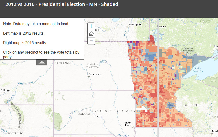
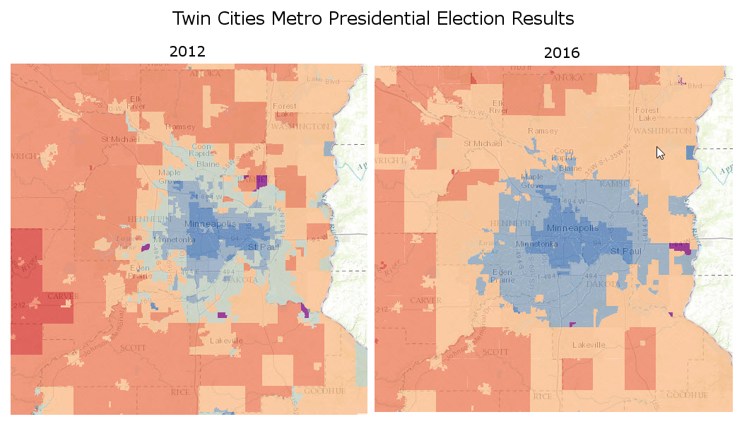
After posting maps of which party won each precinct in Minnesota for 2012 and 2016, I received several requests for maps shaded to reflect how big each party won each precinct. So here they are!
As expected, the maps do not show the same stark picture as the absolute maps…and as it has been pointed out elsewhere, perhaps we’re not quite as divided as we think. Or, at least, the divisions aren’t quite as stark.
The darker the blue or red, the higher the percentage of votes. Purple indicates a tie.

If you want to explore the comparison results, I created a web mapping application: