I started out just wanting to map the election results by voting precinct…just to see if the urban vs rural hypothesis played out in Minnesota. Then I got to thinking…how did it play out in 2012? And why not compare them, right?
Not taking anything into account besides geography, the urban (Democrat) vs rural (Republican) definitely played out in 2016…not so much back in 2012:

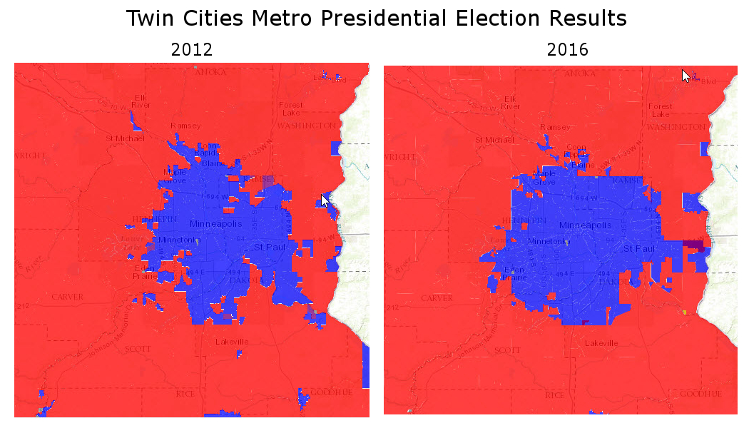
Interestingly, it was even more apparent in the Twin Cities Metro area — in 2012 there were some rural, some suburban parts of the area that voted Republican…not so much in 2016. There was almost a contraction of the blue precincts:
If you want to explore the comparison results, I created a web mapping application:
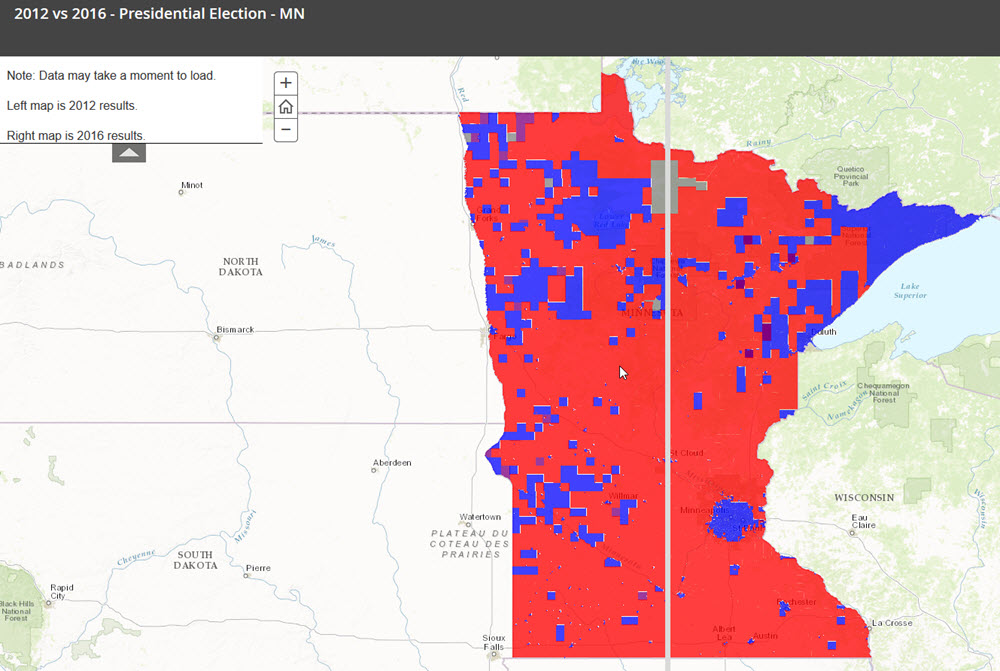
Just note — it’s a bit rough…and in order to make the data play nice (so you can click on any precinct and see the results), it loads a bit slowly…
Enjoy!
UPDATE: I’ve had several requests for maps shaded telative to the percentage of the vote that was Democrat, Republican, etc. — those maps are in the works…